Showing posts with label Quantitative Finance. Show all posts

Monday, November 5, 2018

IMA S.p.A. : relative valuation.

Here we have a relative valuation of IMA S.p.A. It operates in the industrial machinery and equipment, like the peers of the sample. In particular, its business is focused on the packaging industry, through the segment lines : tea, food and other ; pharmaceutical sector. 
In order to select the peers, I considered the following requirements : similar business and geographical area and similar size (revenues or market cap as the proxy of the size), having regard to the differences, like the profitability, the growth, the risk and the financial structure (in this way, I adjusted the market multiples, appropriately or I considered the difference as a discount or as a premium in the valuation ; about the financial position, the differences are very small).
I used a leading market multiple (expected results in the year 2018, 2019, 2020, data source : www.marketscreener.com). I also considered the management assumptions, expectations and business plans.

Let's look at the market multiples, in the following table.


It needs to consider that about the equity story and size GIMA TT ("recent history") seems to be a a distortion compared to the other firms. It can be interesting, regarding its similarity to IMA, however, it is more advisable to exclude it from the peers group.
Then, we can calculate the mean and the median, respectively :

EV/EBITDA (10.08 | 9.44) ; P/S (1.60 | 1,70) ; P/E (18,45 | 17)

At a glance, we can notice the discount of IMA S.p.A, apart price to earnings.

Secondly, it is more useful to link the market multiples to the fundamental variables (profitability and growth, above all). In this way, see the next table.


We can calulate the mean and median, excluding GIMA TT again and IMA, for obvious reasons.

EBITDA margin (15.72% | 18.12%) ; EBIT margin (12.55% | 15.03%) ; NI margin (8.71% | 10.40%)

CAGR EBITDA (8.94% | 7.58%) ; CAGR revenues (6.66% | 5.94%) ; CAGR NI (12,85% | 12.74%)

Substantially, IMA marginality is slighy lower compared to the sector profitability ; however, the growth is rather higher.

Finally, let's put the variables together, thanks to a regression line.

Market Multiples (Y) vs Profitability (X)
Market Multiples (Y) vs Growth (X)

In the two charts, the intercept is not considered because it is not important, in a statistical point of view (statistical significance). However, the angular coefficient is good. The R-squared is excellent, in the following order (from the lowest to the highest) : P/E regression, EV/EBITDA regression and P/S regression.

So, we can determine the fair value of IMA and its premium or discount. In other words, its intrinsic market multiple.

margins
FV (I) = P/E = 181,61*7,30% = 13,25                       
premium : +36,7%

FV (II) = EV/EBITDA = 60,513*15,65% = 9,47     
discount : -7,82%

FV (III) = P/S = 12,88*12,85% = 1,65
discount : -20,24%

growth
FV (IV) = P/E = 120,66*17,54% = 21,16                 
discount : -14,4%

FV (V) = EV/EBITDA = 100,75*12,15% = 12,24   
discount : -28,7%

FV (VI) = P/S = 23,794*7,14% = 1,7                       
discount : -22,3%

Finally, we can conclude than the discount is higher (as I said) with the growth. With the margins, the discount is smaller and we have a premium with the P/E regression. At a glance, IMA is traded at a slighty lower market price compared to its hypothetical fair value. Of course, it does not represent a safety margin, at the moment. The price still could go down for the reason that the trend is clearly bearish. However, the current market price is beginning to be interesting.

Saturday, May 5, 2018

Markowitz efficient frontier : backtesting.

The aim of the analysis is to build the efficient frontier that compares the average return (y) to the risk or standard deviation (x) of the top 100 Italian stocks (the market cap is the proxy of the size). Secondly, I will build one hundred portfolios (each portfolio is composed by one stock and each stock has the same weight, for simplicity), by decreasing order of best risk-reward ratio.
Thirdly, I will test the following assumption : the order of best risk-reward ratio should be the same also for the future performances (at least, substantially). 
In this way, the third step will be the backtesting that will cover a medium/long time frame, for obvious reasons and it will be a continuous updating.

The time frame of the past returns is 5 years : it means sixty returns (monthly returns), from April 30, 2013 to April 30, 2018. The source of the data is the following (historical data) : Investing.com. 
The source of the stock screener is the following : Stock Screener - Investing.com. 

About the data, I converted the monthly returns into annual returns, for greater significance. 

Average Return (annual) = Average Return (monthly) * 12
Standard Deviation (annual) = SQRT [(Standard Deviation (monthly) )^2*12]

So, I adjusted the return for the risk (Standard Deviation), through the following formula : 

Risk Adjusted Return = Average Return / Standard Deviation

Finally, I ranked the stocks, according to the abovementioned ratio (best risk-reward ratio). 
For simplicity, I built ten groups, always respecting the previous order. 
According to the portofolio theory (please consult the links : Markowitz efficient frontier ; images), the best stocks are those with the best ratio : they offers a greater return, given a risk rate or they offers a lower risk, given a return rate. Then, we have the following assumption : the expected returns and the expected risks are based on the past data. Of course, this is a limit and the aim of the analysis is also to implement a backtesting and to test the assumption. 

The following chart shows the efficient frontier. 


The following tables show the ten groups, by decreasing order of best risk-reward ratio (--> ranking).


In the future, I will test the assumption, as mentioned. The stocks with good past performance (with given risk) should outperform the others. 

Monday, April 9, 2018

The "magnitude" of the liquidity.

In the building of a trading strategy, the liquidity is a crucial variable. 
Secondly, the liquidity can be both a positive and a negative factor. 
Of course, we have two market scenarios :
  1. An illiquid market ;
  2. A liquid market. 
In the first one, from the negative point of view, the price of a stock hardly represents the intrinsic value : in other words, the stock price will reflect poorly the underlying drivers of the fundamental analysis. The same is also for the technical analysis. The stock price doesn't correctly respond to the graphic signals. This bias can last for a long time and sometimes the gap cannot be solved. 
In this way, the market context is artificial. 
From the other point of view, we can use that fault to our advantage. That means that it needs to follow the next steps of the market maker. If on one hand, the market maker (aka MM) easily moves the price for lack of liquidity, on the other, we must not suffer this but we must make ourselves part of it. 

In the second scenario, there is not the abovementioned bias because the market price responds quickly to the underlying factors (technical or fundamental). However, we cannot use to our advantage the previous fault. The market context is normal. 

Finally, the first scenario is difficult to manage than the second one because the illiquid market is difficult to interpret. Neverherless, if we are be able to follow the MM's moves, this will lead to higher profits for the reason that the stock price is much more influential to price changes in the face of low traded volume, due to the market structure.   

After this introduction, it is useful to indentify the two scenarios (1. and 2.) and above all the magnitude of the price influenceability. 

The following methodology shows that. The steps are : 

  1. Building the daily returns (%) for a time period (in general, one year is appropriate) ;
  2. Building the daily trading volumes ;
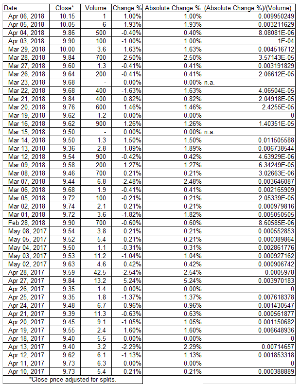
  3. Pondering the first one with the second one ; in other words, we consider the ratios (the daily returns are as absolute returns ; we are interested in the amplifying effect and we are not interested in the direction of the effect). The formula is :

[Absolute Price Change %] / [Trading Volume]

The Absolute Price Change % is equal to ABS(Price Change %)


Finally, we calculate an average value of the previous ratio (=AVERAGE[Absolute Price Change %] / [Trading Volume]). Then, we multiply the average ratio for different and hypothetical volume levels. In this way, we can get an idea of the influence of volume on stock price (-> we get the hypotethical price changes % for given volumes). 

Of course, this represents the market structure and it should not be considered as a correct value a priori. There are many variables that can change the survey data and the past trend is not like the future trend : the trading book and the market environment are some factors. 

In the following chart, we have an example of illiquid market. The stock is COVER 50 S.p.A., a classic example of illiquid stock. The daily volumes are low and we can notice that it needs just a small volume to get a considerable price change (for a trading volume of 1K we have a price change % of 3.48%). 

Daily Returns, from April 10, 2017 to April 6, 2018, hidden cells
for space requirements, data source : Yahoo Finance

We can also analyse the abovementioned effect through a regression line.


In the following charts we have an example of liquid market, the stock is UNICREDIT S.p.A. 
The daily volumes are huge and in this way it needs a huge volume to get a substantial price change (indeed, for a trading volume of 1K we have a price change % of 7.85189E-07). 
For obvious reasons, the slope of the regression line is lower than the previous one. 

Daily Returns, from April 10, 2017 to April 6, 2018, hidden cells
for space requirements, data source : Yahoo Finance

Tuesday, August 22, 2017

Event-study strategy.

An event-study is a statistic method applied to the financial markets that has the purpose to measure the relevance/irrelevance of an event on the stock prices ; in other words, we value if an event is or is not price-sensitive, "over the normal returns", calculated by a market model through the following regression : 

R(stock) = α + β*R(benchmark)

R are the returns, expressed as a percentage, respectively of a single bond (the subject of the analysis) and of the benchmark (a market index).

α is the intercept.

β is the slope. 

An Event-study strategy has the aim to :
  • value the relevance of an event (like the earnings releases, like a particular press release, like a macro-event and so on) ;
  • value the impact and the statistical significance of the event ;
  • measure the market moves of the insiders and the market mood, at the time of the event ;
  • by combining the previous aspects, it means to make profitable a trade just buying or just selling the stocks (it depends on the specific situation) a moment before the event (some days, a week or a month before).  
The success of the strategy is not absolute but it is very true as the event is significative and repeatable. As known, the market is unpredictable and facing the same news, we could have a different market reaction. 

The following case shows the strategy. We speak about the full year 2016 results of Moncler S.p.A. The press release is dated 28, February 2017.

As the theory says, it needs to create a "window" in three parts :
  1. Estimation window, useful to build the regression (usually, it is a period of 252 days) ;
  2. Event window, the window of the event (it is a period of 6 days, 2 days before the event, the day of the event, and 3 days after the event, to cover any delays or news leaks) ; 
  3. Post-event window, useful to value the impact of the event in the following days.
In this way, we can build the regression : we take the historical returns of the stock (Moncler, Y) and of the market index (FTSE-mib, X). The regression is shown in the following image. 


The parameters of the regression are the following (see the table).


For the returns (change %), I used the historical data from Investing.com and I put them on a spreadsheet. 


The estimation window is the period from March 3, 2016 to February 23, 2017 (in the image, there are some hidden cells, for space requirements).
The event window is the period from February 24, 2017 to March 3, 2017. 
The post-event window is the period from March 6, 2017 to March 31, 2017.

With the regression, we measure the abnormal returns (AR). 
The formula of the abnormal returns is :

(Effective return of the stock - Estimated return from the market model).

The estimated return is equal to [α + β*(effective return of the market index)].

The AR test t is : AR / STD.ERR.(YX).

To understand if the AR is significative and so if the event is price-sensitive, it needs to measure the statistic significance of the AR : is the absolute value of the AR test t is greater (YES) or less (NO) than 1.96 ? 

Abnormal returns (AR) in the event window

We can conclude that the earnings release impacted positively on the stock prices and that the event was significative. Just buying before the event, betting on the publication of good data, it would have been profitable. The following image shows the candlesticks chart of the event. 

Chart from Investing.com

As I previously said, the good success is basically based on the repetition of the event and the importance of the event itself. It means also that there is the same market reaction in every occasion (it is not so obvious). 

With Moncler, there are many aspects that confirm this, see the following link :

Monday, May 1, 2017

Cement industry : Cementir Holding S.p.A. and the value map.

Here we have a classic value map that relates the market multiple P/S (price to sales) to its intrinsic profitability (EBIT/sales or EBIT margin or ROS) and then the mentioned multiple to the expected growth, from the year 2017 to the year 2019 (data source estimates : www.4-traders.com). 


The expected growth is the CAGR, aka cumulative average growth rate. 
The formula is the following : 

[(expected revenues fiscal year 2019/revenues fiscal year 2016)]^(1/3)-1

It is expressed as a percentage. 

The meaning of the relationships (P/S-ROS and P/S-CAGR) is that higher the multiple (P/S), higher the margin (ROS) and higher the multiple (P/S), higher the expected growth (CAGR) and viceversa. 
Obviously, the market generally rewards the firms with higher profitability and with higher growth, with a major market price. 
The relationships can be shown as a value map, particularly through a regression line. 
We have two equations : 

1) P/S = a + b*ROS

P/S = y ; ROS = x

2) P/S = a + b*CAGR

P/S = y ; CAGR = x

In both cases, the intercept (a) was removed for the reason of the low statistical relevance. 
The RSQ is high (0.9070 and 0.8488), which means the strenght of the model.
Graphically, we can note that the relations are clear, substantially : higher the market multiple, higher the profitability and the expected growth.


The stocks above the regression line (dashed line) are overvalued, the stocks below the regression line are undervalued. In this way, for Cementir Holding, we get a "value gap" that is equal to :

[P/S (effective)-P/S(calculated from the market model)] : [P/S(calculated from
the market model)]

The P/S (effective) is 0.72.
The P/S (calculated from the market model) is equal to (9.10%*12.54).

There are also some "outsiders" (Vulcan Materials, Eagle Materials). The profitability is very high compared to the peers. Indeed, we have a multiple P/S of about 4X.

Likewise, for the relationship P/S-CAGR : see the following chart.


The discount ("value gap") is much greater, 71.94% vs 36.91%. The "growth adjusted market multiple" is preferable to the "multiple adjusted for the profitability".

If we remove the two outsiders from the sample, the statistical models are stronger : RSQ is higher, the relations are more even significative. However, the discounts are lower : 10.36% vs 36.91% and 57.16% vs 71.94%.


Finally, Cementir Holding is cheaper than the peers. Secondly, in my opinion, the stock is much more attractive in the area 3.80-4.80 : we could benefit more so from the discount prices and from a possible graphic retracement (see the chart), event if the current prices and expectations are interesting.

Chart from Investing.com

Tuesday, April 25, 2017

Geox S.p.A. : the historical correlation with the FTSE-mib is significative.

If we look at the historical chart of Geox (red) compared with the FTSE-mib (blue), we can notice that the similitude  is clear : some exceptions apart (like the section of the circled graph, yellow ellipse), the direction of the two assets is substantially the same. To make the comparison more effective, the chart is divided into vertical lines that represent the date ranges with equal period (150 bars) : the most important thing is to value the same direction of the two graphs, inside the date range, in order to have the correlation ; otherwise, the two assets would be unrelated.
In this way, the last performance of Geox is driven by the trend of the FTSE-mib, most likely. 
Indeed, the positive newsflow is absent and the fundamentals are weak (see the last news) : they don't justify all this ; the perfomance is related to the macro context. 


Chart from Investing.com


The statistical analysis confirms that, too. With sixty returns (monthly time frame, from 2012 to 2017, five years), we can build the regression analysis. 


Historical data from Investing.com

The results show a beta of about 0.93 in the classic market model, as the following equation : 

GEOX (y) = a + beta*FTSE-mib (x)

If the beta is 1, it is how to hold the index ; if we have lower values, the asset (GEOX) dampens the index movements ; otherwise, with higher values, the stock amplifies the FTSE-mib movements ("leverage effect"). The correlation with the FTSE is evident. We have two outputs for the reason that in the first result, the intercept (a) is sparely significant (see the Stat t or the significance value). We discarded that and finally, we got an equation in the following form :

GEOX (y) = beta*FTSE-mib (x)

RSQ (0.3098) could be low ; it says that 30.98% of the Geox returns (variability) is explained by FTSE-mib returns. However, the CAPM literature shows that for the stocks, on average, the percentage is equal to 30-40% ; for the rest, specific factors affect stock performance. 


At the same time, we have the scatterplot (see the following chart). 


To conclude, another statistical indicator is the Pearson correlation coefficient : with the previous returns (see the second table), we got a value of 0.55 ; it means that there is a positive correlation between the two assets, Geox and FTSE-mib. Secondly, if we analyze the signs of the returns, we can see that in 65% of cases (39/60) the sign is the same (+,+ or -,-) and in 35% of cases (21/60) the sign is different (+,- or -,+). The relation is positive and significative.