Showing posts with label Volatility. Show all posts

Sunday, January 17, 2021

EUR/GBP: a test of the lows.

At first glance, we can notice the repeated test of the bottoms;  this fact is known as a confirmation of the buyers' strength in that resistance area: for this purpose, look at the green arrows; the fact is recurring six times if we consider also the last trading session; a break with other confirmations could trigger a bearish set-up until 61.80% FIBO level (at about 0.874) or even below that level, at about 0.867, the lower side of the first rectangle area (from April to June).

Indeed, the mentioned lows are highlighted also by the lower side of the following rectangle areas (from June to September; from September until today. The last rectangle area is bordered at the top by 23.60% FIBO level that links the top (at about 0.949) and the double bottoms, at about 0.827 (100% retracement). 

The chart shows also the discharge of both oversold and volatility, from the lower band of the BBs and the consequential rebound in prices: it is very important to follow the next trading sessions, in order to understand the market moves and in order to set a bullish or trading strategy, respectively; the chart picture is very promising in a rebound, considering what happened before. 


Chart from Markets.com


To conclude, the price is also near the 50% FIBO level at about 0.888, a critical level in one direction or another. Let's look at it, in assessing the market intentions. 

Wednesday, September 23, 2020

EUR/CHF: a trading range.

If we look at the chart, we can notice that the most suitable trading strategy is the trading range, among the two FIBO levels, respectively at about 1.072 (lower level and support, buy-level) and at about 1.085 (upper level and resistance, sell/short-level). The two levels represent 38.20% and 78.60%, FIBO retracements of the movement top-bottom, from the high of June 2020 (1.091) to the low of July 2020 (1.06). The prices are fluctuating in that trading range area or rectangle area: in other words, the break of the upper or of the lower area could trigger two targets above and below, at least near the previous top (100% FIBO) or at least near the previous bottom (0% FIBO).
If the conditions will not change, this is the current context, due to the chart framework.


Chart from Markets.com


The trading range is marked also by the flattening of the EMA bundle and also by other indicators like MACD, RSI, CCI. The latter report neither an overbought nor an oversold area. It is a general flattening and rebalancing among bulls and bears. After a bullish wave until 1.091, we have seen total reabsorption: now, it is a lateral trend marked by the restricted volatility of the BBs and of the PSAR.
The presence of small candles or candles with small bodies emphasizes the mentioned market context: we speak of many candles with upper or lower shadows or Doji candles; the only and remarkable ups and downs are shown by long candles, green or red, however always within the rectangle area.
We just have to wait for the next market sessions; until then, we need to trade that area.

Sunday, May 3, 2020

AUD/NZD: a pullback.

At first glance, we can notice a pullback in the chart, from the previous top at 1,075.
The pullback comes from the upper band of the BBs. It is also highlighted by a candlestick pattern: specifically, a shooting star; its upper shadow (maximum) represents the stop loss of a short trading strategy; then, the red color and the following red candles are a reliable signal, for this purpose.
Anyway, it is too early to speak about a trend reversal even if this signal is a good starting point. 
Let's look at the next trading sessions, at the crossover, respectively, of the RSI (repulsion from the overbought area, 70), of the MACD (cross of the signal and MACD line) and of the momentum (from above to below, the zero line).

Chart from Markets.com

With the confirmation of the trend reversal, it will be interesting the evolution of the chart framework, in particular, about the test of the yellow area, the rectangle, that previously, represented a trading range area, before the current bullish trend. The lows of the rectangle are the main references for the reason that these minimums and support levels were very important, in the past (38.20% FIBO retracement, 1.031/1.032). The same thing for the upper line (61.80% FIBO level, 1.053).
Finally, it is interesting also to look at the volatility: BBs, upper, lower and the median line (red line); the slope and the cross of the EMAs bundle (they are very flattened in the rectangle and TR area; otherwise, they are widely spaced in the bullish and bearish momentum). We can say the same of the parabolic SAR (the black dots).

Tuesday, September 17, 2019

CRUDE OIL : bullish momentum (dumped).

We can notice that the bullish momentum with the last upside has been dampened, for the reason that the white candle is represented by a high wave pattern. The shadows show an equilibrium among the bearish and bullish strengths. 
Then, the gap up has been covered as quickly as possible: in this way, the following candle is a black candle that neutralized the previous candle. 

Chart from Markets.com

The chart shows also the FIBO retracements: 38.20% and 23.60% FIBO levels are respectively at the low of the black candle (see the gap down) and at the previous minimums.  
At the moment, in order to set up a trading strategy, it needs to understand the market direction: the high wave could represent a trading range area; only with a break of the upper or of the lower limit (see the green and red arrows), we could set a bullish or bearish strategy. 

Sunday, September 1, 2019

COFFEE : technical analysis.

At first glance, we can notice a break in the downtrend. This last one started in July.
The previous trend was bullish, see the parallel channel. 
The break of the downtrend is bordered by the two dotted lines (at about 95 and 100): the 95 value represents also the previous support line and the 100 value is fixed at the maximum of the black Marubozu candle.
The break in the downtrend is also highlighted by the flattening of the MACD indicator and by the proximity of the three lines of the BBs (in this way, the volatility is fairly limited). The real bodies of the candles are not so wide and there aren't so many shadows, compared to the previous ones. 
There are also two references: the top at about 125 and the bottom at about 87.
See the image below. 

Chart from Markets.com

If we use another timeframe, for example, 4H timeframe, we can get a focus.
The break (from August to September) in the downtrend is confirmed, too. The lack in the slope of the EMA bundle highlighted this concern while in the previous situations, the slope is so marked and the flattening is totally faraway. 

Chart from Markets.com

To conclude, pay attention to the two references at 95 and 100. In this way, there is a trading range area that can be used to set up a trading strategy. With the break respectively of the upper area or of the lower area, we could set up another trading strategy, bullish or bearish. As usual, it needs other signals that confirm that hypothesis.

Saturday, March 30, 2019

IMA S.p.A. : high wave pattern.

With regard to the chart of IMA, we can notice a high wave pattern. 
It is a particular candlestick pattern that underlines the market indecision. In this way, after the full year 2018 data release, and after a bullish trend, with the break of the previous congestion area, the bullish trend stopped. The market maker is evaluating the situation.
Indeed, the buyers, at the closing, left (the long upper shadow of the candle changed into a small real body). In the same way, the sellers left, for the reason that the long lower shadow changed into a small real body: there was strong volatility with a rebalancing of the positions sellers-buyers. 
See the following chart and the pattern. 

Chart from Investing.com

The upper and lower shadow represent respectively the resistance and the support area.
The market will make a decision when there will be a break of the support or of the resistance line.
As usual, we need other confirmations. In this sense, it is useful to check the pattern requirements.
In the high wave pattern, there are some conditions : 
  • A small real body ;
  • A long upper shadow ;
  • A long lower shadow ;
  • The length of the upper/lower shadow should be three times the real body.
With regard to the last one, we can observe that :
  •  O (open) - C (close) = small real body = 66.60 - 66.25 = 0.35
  •  H (high) - O (open) = long upper shadow = 68.50 - 66.60 = 1.90
  •  C (close) - L (low) = long lower shadow = 66.25 - 62.80 = 3.45
The pattern requirements are met because :
  • 1.90/0.35 = 5.43
  • 3.45/0.35 = 9.86
Finally, let's look at the market mood and at the next trading sessions, to understand the intentions of the market players. For greater clarity, the following image shows what I explained before.

High wave pattern

Monday, April 9, 2018

The "magnitude" of the liquidity.

In the building of a trading strategy, the liquidity is a crucial variable. 
Secondly, the liquidity can be both a positive and a negative factor. 
Of course, we have two market scenarios :
  1. An illiquid market ;
  2. A liquid market. 
In the first one, from the negative point of view, the price of a stock hardly represents the intrinsic value : in other words, the stock price will reflect poorly the underlying drivers of the fundamental analysis. The same is also for the technical analysis. The stock price doesn't correctly respond to the graphic signals. This bias can last for a long time and sometimes the gap cannot be solved. 
In this way, the market context is artificial. 
From the other point of view, we can use that fault to our advantage. That means that it needs to follow the next steps of the market maker. If on one hand, the market maker (aka MM) easily moves the price for lack of liquidity, on the other, we must not suffer this but we must make ourselves part of it. 

In the second scenario, there is not the abovementioned bias because the market price responds quickly to the underlying factors (technical or fundamental). However, we cannot use to our advantage the previous fault. The market context is normal. 

Finally, the first scenario is difficult to manage than the second one because the illiquid market is difficult to interpret. Neverherless, if we are be able to follow the MM's moves, this will lead to higher profits for the reason that the stock price is much more influential to price changes in the face of low traded volume, due to the market structure.   

After this introduction, it is useful to indentify the two scenarios (1. and 2.) and above all the magnitude of the price influenceability. 

The following methodology shows that. The steps are : 

  1. Building the daily returns (%) for a time period (in general, one year is appropriate) ;
  2. Building the daily trading volumes ;
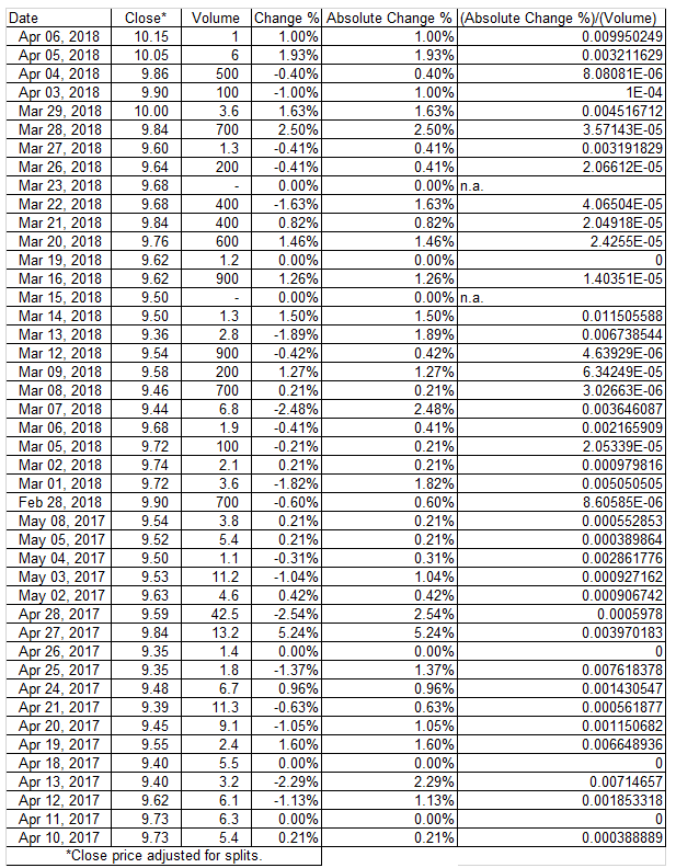
  3. Pondering the first one with the second one ; in other words, we consider the ratios (the daily returns are as absolute returns ; we are interested in the amplifying effect and we are not interested in the direction of the effect). The formula is :

[Absolute Price Change %] / [Trading Volume]

The Absolute Price Change % is equal to ABS(Price Change %)


Finally, we calculate an average value of the previous ratio (=AVERAGE[Absolute Price Change %] / [Trading Volume]). Then, we multiply the average ratio for different and hypothetical volume levels. In this way, we can get an idea of the influence of volume on stock price (-> we get the hypotethical price changes % for given volumes). 

Of course, this represents the market structure and it should not be considered as a correct value a priori. There are many variables that can change the survey data and the past trend is not like the future trend : the trading book and the market environment are some factors. 

In the following chart, we have an example of illiquid market. The stock is COVER 50 S.p.A., a classic example of illiquid stock. The daily volumes are low and we can notice that it needs just a small volume to get a considerable price change (for a trading volume of 1K we have a price change % of 3.48%). 

Daily Returns, from April 10, 2017 to April 6, 2018, hidden cells
for space requirements, data source : Yahoo Finance

We can also analyse the abovementioned effect through a regression line.


In the following charts we have an example of liquid market, the stock is UNICREDIT S.p.A. 
The daily volumes are huge and in this way it needs a huge volume to get a substantial price change (indeed, for a trading volume of 1K we have a price change % of 7.85189E-07). 
For obvious reasons, the slope of the regression line is lower than the previous one. 

Daily Returns, from April 10, 2017 to April 6, 2018, hidden cells
for space requirements, data source : Yahoo Finance

Sunday, February 4, 2018

Enel S.p.A. : chart update.

Here we have the chart update of Enel S.p.A. : the previous bullish trend has been confirmed ; indeed, the tops at 4.50 EUR and the top at 4.87 EUR are still valid (the same also for the dashed line, in the medium/long term) ; the pattern recognition (Dark Cloud Cover) has confirmed the change of the uptrend but strictly limited to the short-term. 
In this way, the last view was spot-on (for further info, please see the link http://michelecarollo.blogspot.it/2017/09/enel-spa-chart-framework.html). In the following charts, I propose the updated analysis with the previous levels. 

Chart from Investing.com

Now, let's look at the chart framework of the current situation. We must pay attention to the levels identified by the yellow circles (see also the FIBO retracements) : from the top to the bottom, 5.60, 4.80, 4.50, 3.40, 2.00. This is an overview to set a bullish or a bearish trading strategy, of course. 

Chart from Investing.com

We can notice a break in the previous parallel channel. This means that it is a first alert : it represents a price correction in the uptrend (even more so with a break of the support at about 5.00 EUR and then with a break of the top/FIBO level at about 4.80 EUR). The chart shows a volatility excess with the BBs indicator : that can be a rebound of the stock (for example, see the first red circle) or a confirmation of the abovementioned correction. The crossing of the EMA 50 and EMA 100 fits in this view. Therefore, the next trading sessions will be crucial in order to understand the market direction. 

Chart from Investing.com

If we extend the timeframe, the chart framework is very clear. Here we have a monthly timeframe : the price levels are those already mentioned. 

Chart from Investing.com

Saturday, November 11, 2017

UCG S.p.A. : chart framework.

From a lateral trend (July-until the end of the year 2017), the stock began an uptrend until about mid-year (2017). More recently, UCG has a lateral trend again. This trend has just formed : in this way, it needs to monitor the next trading sessions, to better understand the subsequent events. 

The first lateral trend is indentified by the two horizontal lines : the support at about 9 EUR and the resistance at about 12 EUR. The uptrend is identified by the two bullish TLs, respectively, below and above the price chart. The previous resistance (12 EUR) becomes support and then, we have another resistance at about 15 EUR. The last one price level is important also for the raison that, between 14 and 15 EUR, we can notice a gap up in the chart. This gap up is a valid level in order to set bearish or bullish trading strategies (see the yellow stripe in the following chart). 
Finally, we can notice the abovementioned lateral trend : it is indentified in the same way like the previous one by the horizontal lines (supports and resistances). The support and resistance levels are light blue circles.  

The trend is also shown by the slope of the EMA 40 (red line) : the sequence is flat-upward sloping-flat. Another aspect is that the EMA can be an indicator of the volatility of the asset : wider deviation  of the price chart from the EMA, higher volality and viceversa. This arrangement is useful to set purchase or sale orders. 

Chart from Investing.com

If we extend the timeframe, we get the same conclusions : with a weekly chart, the sequence is lateral trend-uptrend-lateral trend. Now, the RSI is not overbought : the allert levels are 30 and 70. Previously, there was a "RSI exhaust",  an oversold, in the first half of the year 2016. 

Chart from Investing.com

Lastly, it's interesting to see the FIBO retracements (see the chart below). I set the 100% and the 0% FIBO level, respectively at the bottom (8.54 EUR) and at the top (18.36 EUR). The yellow circles indentify the previous price levels (supports and resistances). This is another confirmation. 

Chart from Investing.com

This is the substantial chart framework. However, we must not to forget that other factors influence the stock market. UCG belongs to the banking sector. In this way, primarily, it means that its price will be directly correlated to the macroaggregate events and to the italian economy and italian politics. The beta of the stock is about 1.93 : we have an high leverage compared to the FTSE-mib. 

Data source : FT.com

The comparative chart UCG-FTSE-mib is very explanatory.

Chart from Investing.com

Thursday, September 14, 2017

Enel S.p.A. : chart framework.

Here we have the chart of Enel S.p.A. : the stock broke the resistance at about EUR 4.50 (the previous maximums, yellow circles) and then, it broke the previous top at about EUR 4.90 (red circles). From a lateral trend (between 3.50 and 4.50), the stock began a bullish trend (still in progress) since the beginning of the year 2017. The bullish trend is highlighted with a blue parallel channel. We have another confirmation (also in the medium/long period) with the dashed line that is still valid. We can say that there is a clear bullish trend and unless conditions change, it will be confirmed : only with a break of the previous top (red circle) but mainly with a break of  the tops at 4.50, there may be a change in the trend and consequently a test of the lateral trend area (abovementioned). The change of the trend must be accompanied with high volumes, other patterns and other confirmations, in the following trading sessions, of course (at present, it is a bullish trend). 

Chart from Investing.com

The slope of the EMA (60 and 20) shows the uptrend, too. The RSI is not overbought but the values are in the neighborhood of the upper line. The bullish trend is strong but there are not nearly retracements. The uptrend needs a break (at least, in the short term).


Chart from Investing.com

The FIBO retracements indentify the previous price levels (see the first chart and see the blue circles) of the past resistances. It is very important to focus on those to set a short or long trading strategy, even if the trend is bullish, clearly. 

Chart from Investing.com

Analyzing the short-term, we can see that the BB show an high volatility, just after absorbed, with a candlesticks pattern, a Dark Cloud Cover. After a bullish trend, it is a bearish reversal signal. At now, it represents only a "volatility exhaust" and a price correction in the short-term.
See the chart and the following pattern recognition.

Chart from Uk.tradingview.com

A Dark Cloud Cover consists of two candles (white and black) : the black one has the opening price higher than the top of the white one and the closing price lower than the median value of the real body of the white one. As usual, we need a confirmation (a bearish candle after the black candle and a continuation in the trend change). The top of the black candle represents a resistance. 

Sunday, July 30, 2017

The volatility.

The volatility is an important parameter in the financial markets. 
It is useful to : 
  • measure the underlying risk of an asset or portfolio (higher the volatility, higher the risk);
  • set the market orders, stop loss, take profit, limit orders and so on (higher the volatility, "wider" the market orders) ;
  • set the trading profile (higher the volatility with pure trader strategy and lower the volatility with pure investor strategy) ;  
  • measure the market mood (higher the volatility with an important event price-sensitive ; "stock market fever", see also the VIX indicator). 
As there are so many purposes, in the same way, there are so many methods of measuring and indentifying it. At first, the classical measure is the deviation standard. To calculate it, it needs to import the historical returns of an asset to an Excel spreadsheet and then applying the following formula :

=  DEV.ST.POP (historical returns).

Historical data from Investing.com
Here, we have an image that clearly explains the case. The time-period can be daily, weekly, monthly etc, in the analyst's discretion and based on the purpose of the analysis (it means also holding period and investor perspectives). The ticker is APPLE. The time-frame is daily. 

Another measure is that provided by the graph (indicators).  
In this sense, it means respectively : 
  • width of the real bodies and of the shadows (candlesticks chart ; wider the bodies and the shadows, higher the volatility) ;
  • width of the Bollingers Bands (wider the bands, higher the volatility) ;
  • magnitude of the volumes and so market interest (higher the volumes, higher the volatility). 
As shown in the following chart, there is the silmultaneous presence of more detectors (read the notes inside the graph). 

Chart from Investing.com

Indeed, BBW and HV are useful indicators to measure the volatility. There is a peak compared to the historical series (circled ellipses). The Envelopes (EV) have the same meaning of the BB : if the stock price is above or below the envelopes, there is high volatility in both directions.

Envelopes (EV) ; chart from Investing.com

To conclude, once measured and identified the volatility, every trader/investor should set his trading strategy accordingly, pursuing own profit and loss targets, of course. 

Friday, January 6, 2017

Intermarket analysis : focus on luxury sector.

About the relative performance, a year now, the stocks that have performed better are : Kering, Brunello Cucinelli, Hermes, Burberry, C. Dior, Moncler, M. Kors and LVMH. 
In the middle, we have : Salvatore Ferragamo, Yoox-net-a-porter, Prada, R. Lauren, Tod's and Luxottica. The worst are : Safilo, Hugo Boss and Geox.

Chart from Investing.com

About the risk, the luxury sector is an industrial, by definition. It provides low risks (individual, volatility and systematic, beta) in the face of good average returns, compared to banking and financial sector. The last one is far riskier with disappointing returns, over the long-term. The luxury stocks and industrial (in general) are more likely to the investor instead banks are best suited to the pure trader. 
As shown in the following chart, the industrial (green) is in the upper left (high returns, low risks and the financial (light blue) is in the lower right (low returns, high risks). 


The following graph shows risk-reward among the luxury industry, with a time frame of one year (252 returns). All in all, the intraday volatility is low (about 2%) and the same, for the beta (about 0.70), with some outsiders (downward) like Luxottica (1.75%) or C. Dior (1.45%) and (upward) Yoox-net-a-porter (2.73%) or Safilo (2.72%) ; with regard to the market risk (downward), Brunello Cucinelli (0.52) or Luxottica (0.45) and (upward) R. Lauren (1.15) or Hugo Boss (1.07). 
There are also the comparative returns (TE, TEV and IR=TE/TEV), related to the specific benchmarks : Ftse-mib (ITA), cac 40 (FRA), Ftse 100 (GBR), dax (GER), s&p 500 (USA), hang seng (HONG KONG). The best is Kering, the worst is Geox.


Geox is very interesting : there is a huge "performance gap" to cover and, with regard to the business plan and other expectations, at the current prices, it could be an opportunity (see my previous post, dated December 26, 2016, http://michelecarollo.blogspot.it/2016/12/geox-spa-business-turnaround-bp-drivers.html).