Friday, December 31, 2021

AUD/USD: the multiple tests in a trading range.

At a glance, we can notice that the cross is in a trading range (see the yellow rectangle), between 0.72 and 0.727. Those levels are also respectively the 38.20% FIBO level and 50% FIBO level, of a set-up top-bottom 0.755 and 0.70. The 50% FIBO level represents also the upper level of the previous gap-down (see the yellow ellipse).

In this way, the mentioned price levels are very important because they are redundant. Some useful trading strategies should be the following: 

1) a short set-up from top to bottom (in the trading range, 0.727-0.72);

2) a long set-up from bottom to top (in the trading range, 0.72-0.727);

3) a short set-up of a wider scope, with a longer time frame, outside the rectangle; in other words, short at the break of 0.72, with confirmations and targets the lower FIBO levels, before 0.712, then 0.70;

4) a long set-up of a wider scope, with a longer time frame, outside the rectangle; in other words, long at the break of 0.727, with confirmations and targets the upper FIBO levels, before 0.733, then 0.743.

With this chart framework, the rectangle (or trading range) is the real focus: so, it is very important to look at it, in order to build our trading strategy, in one direction or another.

The following chart is explicative, of course. 


Chart from Markets.com

If we change the time frame, with a 4H chart, the view is the same.

The chart shows the multiple tests of the cross, at the tops of the rectangle. The tests are highlighted also by other indicators and oscillators, like RSI, CCI, and Williams %R.

The cross is in the overbought area: +100 for CCI, -20 for Williams %R, and +70 for RSI. This should represent a trend change (from an uptrend to a downtrend, from overbought area to oversold area) if the confirmations will occur, as previously said. At the moment it could be just a movement included in the trading range and a repulsion area with the tops of the rectangle as a resistance area.

The same thing is valuable in the hypothesis of the uptrend continuation (and not a reversal, in this way), with the break of the mentioned resistance area. 

To conclude, let's keep focused on the rectangle and on its levels, also if we look at the candlesticks chart: there are a lot of Doji candles and candles with large shadows; they represent a lack of trend, for the moment and otherwise, they are the symbol of a real trading range area.


Chart from Markets.com


Sunday, January 17, 2021

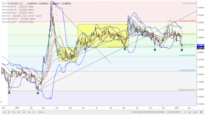
EUR/GBP: a test of the lows.

At first glance, we can notice the repeated test of the bottoms;  this fact is known as a confirmation of the buyers' strength in that resistance area: for this purpose, look at the green arrows; the fact is recurring six times if we consider also the last trading session; a break with other confirmations could trigger a bearish set-up until 61.80% FIBO level (at about 0.874) or even below that level, at about 0.867, the lower side of the first rectangle area (from April to June).

Indeed, the mentioned lows are highlighted also by the lower side of the following rectangle areas (from June to September; from September until today. The last rectangle area is bordered at the top by 23.60% FIBO level that links the top (at about 0.949) and the double bottoms, at about 0.827 (100% retracement). 

The chart shows also the discharge of both oversold and volatility, from the lower band of the BBs and the consequential rebound in prices: it is very important to follow the next trading sessions, in order to understand the market moves and in order to set a bullish or trading strategy, respectively; the chart picture is very promising in a rebound, considering what happened before. 


Chart from Markets.com


To conclude, the price is also near the 50% FIBO level at about 0.888, a critical level in one direction or another. Let's look at it, in assessing the market intentions. 

Wednesday, September 23, 2020

EUR/CHF: a trading range.

If we look at the chart, we can notice that the most suitable trading strategy is the trading range, among the two FIBO levels, respectively at about 1.072 (lower level and support, buy-level) and at about 1.085 (upper level and resistance, sell/short-level). The two levels represent 38.20% and 78.60%, FIBO retracements of the movement top-bottom, from the high of June 2020 (1.091) to the low of July 2020 (1.06). The prices are fluctuating in that trading range area or rectangle area: in other words, the break of the upper or of the lower area could trigger two targets above and below, at least near the previous top (100% FIBO) or at least near the previous bottom (0% FIBO).
If the conditions will not change, this is the current context, due to the chart framework.


Chart from Markets.com


The trading range is marked also by the flattening of the EMA bundle and also by other indicators like MACD, RSI, CCI. The latter report neither an overbought nor an oversold area. It is a general flattening and rebalancing among bulls and bears. After a bullish wave until 1.091, we have seen total reabsorption: now, it is a lateral trend marked by the restricted volatility of the BBs and of the PSAR.
The presence of small candles or candles with small bodies emphasizes the mentioned market context: we speak of many candles with upper or lower shadows or Doji candles; the only and remarkable ups and downs are shown by long candles, green or red, however always within the rectangle area.
We just have to wait for the next market sessions; until then, we need to trade that area.

Sunday, May 3, 2020

AUD/NZD: a pullback.

At first glance, we can notice a pullback in the chart, from the previous top at 1,075.
The pullback comes from the upper band of the BBs. It is also highlighted by a candlestick pattern: specifically, a shooting star; its upper shadow (maximum) represents the stop loss of a short trading strategy; then, the red color and the following red candles are a reliable signal, for this purpose.
Anyway, it is too early to speak about a trend reversal even if this signal is a good starting point. 
Let's look at the next trading sessions, at the crossover, respectively, of the RSI (repulsion from the overbought area, 70), of the MACD (cross of the signal and MACD line) and of the momentum (from above to below, the zero line).

Chart from Markets.com

With the confirmation of the trend reversal, it will be interesting the evolution of the chart framework, in particular, about the test of the yellow area, the rectangle, that previously, represented a trading range area, before the current bullish trend. The lows of the rectangle are the main references for the reason that these minimums and support levels were very important, in the past (38.20% FIBO retracement, 1.031/1.032). The same thing for the upper line (61.80% FIBO level, 1.053).
Finally, it is interesting also to look at the volatility: BBs, upper, lower and the median line (red line); the slope and the cross of the EMAs bundle (they are very flattened in the rectangle and TR area; otherwise, they are widely spaced in the bullish and bearish momentum). We can say the same of the parabolic SAR (the black dots).