Monday, April 9, 2018

The "magnitude" of the liquidity.

In the building of a trading strategy, the liquidity is a crucial variable. 
Secondly, the liquidity can be both a positive and a negative factor. 
Of course, we have two market scenarios :
  1. An illiquid market ;
  2. A liquid market. 
In the first one, from the negative point of view, the price of a stock hardly represents the intrinsic value : in other words, the stock price will reflect poorly the underlying drivers of the fundamental analysis. The same is also for the technical analysis. The stock price doesn't correctly respond to the graphic signals. This bias can last for a long time and sometimes the gap cannot be solved. 
In this way, the market context is artificial. 
From the other point of view, we can use that fault to our advantage. That means that it needs to follow the next steps of the market maker. If on one hand, the market maker (aka MM) easily moves the price for lack of liquidity, on the other, we must not suffer this but we must make ourselves part of it. 

In the second scenario, there is not the abovementioned bias because the market price responds quickly to the underlying factors (technical or fundamental). However, we cannot use to our advantage the previous fault. The market context is normal. 

Finally, the first scenario is difficult to manage than the second one because the illiquid market is difficult to interpret. Neverherless, if we are be able to follow the MM's moves, this will lead to higher profits for the reason that the stock price is much more influential to price changes in the face of low traded volume, due to the market structure.   

After this introduction, it is useful to indentify the two scenarios (1. and 2.) and above all the magnitude of the price influenceability. 

The following methodology shows that. The steps are : 

  1. Building the daily returns (%) for a time period (in general, one year is appropriate) ;
  2. Building the daily trading volumes ;
  3. Pondering the first one with the second one ; in other words, we consider the ratios (the daily returns are as absolute returns ; we are interested in the amplifying effect and we are not interested in the direction of the effect). The formula is :

[Absolute Price Change %] / [Trading Volume]

The Absolute Price Change % is equal to ABS(Price Change %)


Finally, we calculate an average value of the previous ratio (=AVERAGE[Absolute Price Change %] / [Trading Volume]). Then, we multiply the average ratio for different and hypothetical volume levels. In this way, we can get an idea of the influence of volume on stock price (-> we get the hypotethical price changes % for given volumes). 

Of course, this represents the market structure and it should not be considered as a correct value a priori. There are many variables that can change the survey data and the past trend is not like the future trend : the trading book and the market environment are some factors. 

In the following chart, we have an example of illiquid market. The stock is COVER 50 S.p.A., a classic example of illiquid stock. The daily volumes are low and we can notice that it needs just a small volume to get a considerable price change (for a trading volume of 1K we have a price change % of 3.48%). 
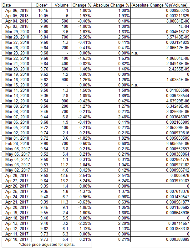
Daily Returns, from April 10, 2017 to April 6, 2018, hidden cells
for space requirements, data source : Yahoo Finance

We can also analyse the abovementioned effect through a regression line.


In the following charts we have an example of liquid market, the stock is UNICREDIT S.p.A. 
The daily volumes are huge and in this way it needs a huge volume to get a substantial price change (indeed, for a trading volume of 1K we have a price change % of 7.85189E-07). 
For obvious reasons, the slope of the regression line is lower than the previous one. 

Daily Returns, from April 10, 2017 to April 6, 2018, hidden cells
for space requirements, data source : Yahoo Finance

Sunday, April 1, 2018

Estimate of the cost of debt.

The calculation of the firm's cost of debt is an important factor. Then, it has a direct application in various areas ; in particular, it is useful : 
  • to build a DCF model, in order to value a company (it is a variable to estimate the WACC) ;
  • to adjust the market multiples (higher the cost of debt, lower the market multiple and viceversa) ;
  • to understand the risk of a business and the debt sustenaibility (in other words, the cost of debt is the proxy of the financial structure) ; 
  • to value the risk of a stock, indirectly.
And on that note, we can analyze the main calculation methods. 

I. The cost of debt : the accounting method.

The accounting method is based on balance sheet data. It is easy to estimate but it is also quite prone to errors. It means that if on one hand, the data are readly available, on the other the result is purely static because it doens't consider the perspective scenarios. Indeed, it is advisable to integrate the method with a perspective business plan, focused on the financial structure of the target firm. 

According to this method, the cost of debt is equal to the financial expenses divided by the financial debt. There are two options : the first one considers the gross debt minus the cash and cash equivalents (it means that the debt can be paid by the cash ; this hypothesis is not always true) ; the second one considers the gross debt and the interest expenses (this hypothesis is more prudential). 

Here we have an example ; the company is Amplifon S.p.A. We can notice the two options. The accounting data are the fiscal years 2017 and 2016. 
For further info, please consult the following links : 


As shown in the table, the cost of debt is equal to 7,41% if we consider the net debt and it is equal to 4,63% if we consider the gross debt. An important note : the interest expenses are divided by the average debt with the aim to make comparable the two quantities, the item of the income statement ("flow quantity") and the item of the balance sheet ("stock quantity"). 

Another option of the accounting method is the following : we can also consider an average figure of the cost of debt on several years (3-5 years). In the same way, we can build a perspective table with the estimated financial debt and interest expenses (the next 3-5 years at the place of the past ones). 

II. The cost of debt : the relation between the interest coverage ratio and ratings (the fundamental analysis drivers).

We can link the interest coverage ratio (= EBIT/net financial expenses) to the ratings of a sample. 
For example, the professor A. Damodaran (see the link,--> Ratings, Spreads and Interest Coverage Ratios, http://pages.stern.nyu.edu/~adamodar/) has built a sample with the rated companies in United States. There are two tables : for large, for smaller and riskier companies (the proxy of the size is the market cap). With the current exchange rate and with the current m. cap, Amplifon belongs to the second group (https://www.investing.com/currencies/eur-usd). 

Data source : Damodaran Online

The cost of debt is equal to :

Risk-free rate (Rf) + Default Spread (DS)

For Amplifon the DS is equal to 0.90% (the EBIT interest coverage ratio is 7.76 and the market cap is about $4 billion). For the Risk-free rate (Rf), we can use the annual return of the 10-year T-bond (see the link http://www.stern.nyu.edu/~adamodar/pc/datasets/histretSP.xls ; data source Damodaran Online). For the year 2017, it is equal to 2.80%. In this way, the cost of debt for Amplifon is :

2.80% + 0.90% = 3.70%

As I said, the sample consists of US companies. For a more appropriate sample, of course, it is advisable to use European companies and rate of returns of government bonds, similarly. 

Finally, we must remember that the spread that we add to a base rate can be determined by other fundamental ratios (the interest coverage ratio is just one of the drivers). In this way, the discussed methodology is a part of the framework based on the fundamental analysis. 

III. The cost of debt : the listed bonds.

The last method is among the most reliable and the easiest to apply methods. If we have a firm with listed bonds, the cost of debt is equal to the rate of return of the mentioned bonds (-->yield to maturity, YTM). Alternatively, we can take as a benchmark a panel of similar listed bonds.

For Amplifon, we can consider the bond listed on the Luxembourg Stock Exchange (LuxSE).
See the following link : https://www.bourse.lu/security/XS0953207759/200201

Sunday, February 4, 2018

Enel S.p.A. : chart update.

Here we have the chart update of Enel S.p.A. : the previous bullish trend has been confirmed ; indeed, the tops at 4.50 EUR and the top at 4.87 EUR are still valid (the same also for the dashed line, in the medium/long term) ; the pattern recognition (Dark Cloud Cover) has confirmed the change of the uptrend but strictly limited to the short-term. 
In this way, the last view was spot-on (for further info, please see the link http://michelecarollo.blogspot.it/2017/09/enel-spa-chart-framework.html). In the following charts, I propose the updated analysis with the previous levels. 

Chart from Investing.com

Now, let's look at the chart framework of the current situation. We must pay attention to the levels identified by the yellow circles (see also the FIBO retracements) : from the top to the bottom, 5.60, 4.80, 4.50, 3.40, 2.00. This is an overview to set a bullish or a bearish trading strategy, of course. 

Chart from Investing.com

We can notice a break in the previous parallel channel. This means that it is a first alert : it represents a price correction in the uptrend (even more so with a break of the support at about 5.00 EUR and then with a break of the top/FIBO level at about 4.80 EUR). The chart shows a volatility excess with the BBs indicator : that can be a rebound of the stock (for example, see the first red circle) or a confirmation of the abovementioned correction. The crossing of the EMA 50 and EMA 100 fits in this view. Therefore, the next trading sessions will be crucial in order to understand the market direction. 

Chart from Investing.com

If we extend the timeframe, the chart framework is very clear. Here we have a monthly timeframe : the price levels are those already mentioned. 

Chart from Investing.com

Sunday, December 10, 2017

The management efficiency : cost-to-income of the italian banks.

The cost to income ratio is equal to the operating costs divided by the intermediation margin. 
In other words, using the bank balance sheets items, it is equal to the following expression :

COST/INCOME RATIO : operating costs ("item 230") / total banking income ("item 120")

The meaning is : the lower the value expressed by the indicator, the greater the efficiency of the bank. Usually, the index is expressed as a percentage. Otherwise, the operating expenses are a percentage of the operating income. The ratio is also useful to value the productivity and the profitability for the banks. 

Here we have a sample : it is the peer group of the main banks, in Italy. In order to have a fair comparison, I used the adjusted results and I used the same criteria with regard to the same period, last year (we speak about the nine months ended on 30th September 2017 and about the nine months ended on 30th September 2016). For further info, please consult the notes below the table (1-7) and visit the section investor relations. 


At a glance, we can notice that : 

  • The efficiency is substantially the same compared to last year ; indeed, we can see a slight improvement, in general.
  • We have two banks that represent the outliers of the peer group : CVAL and CRG ; the ratios had a strong worsening, compared to the nine months of the year 2016. 
  • In the same way, we have other outliers (by the positive side), FBK and BGN. However, the two banks have a similar cost/income ratio, substantially, compared to last year. Reasoning by p.p. : by the negative side, about + 60 p.p. ; by the positive side, about from -2 to -7 p.p. (2017 vs 2016). 
  • Following the considerations of the previous points, it is more useful to focus on the median than on the mean. See the following table. 

Finally, the bar chart is much more explanatory. The two period have two colors, respectively, the light blue for the year 2017 and the red for the year 2016. The median is highlighted by a horizontal line.


With the aim of ranking the abovementioned banks, we have :

1) BGN ; 2) FBK ; 3) ISP ; 4) IFIS; 5) BPSO ; 6) MED ; 7) UCG ; 8) BMPS ; 9) BPER ; 10) UBI ; 11) CREDEM ; 12) BANCO BPM ; 13) CVAL ; 14) CRG.