Sunday, November 24, 2019

COCOA : chart framework.

At first glance, we can notice a volatility exhaust: there is a repulsion from the previous top (0% FIBO level); the commodity is in the upper line of the BBs, then the RSI shows an overbought momentum (the red line crosses from above to below the higher limit at about 70.00). 
The bullish impulse seems to stop (see the white candles): anyway, it represents just a break in the uptrend; for this reason, look at the parallel channel that clearly highlights the bullish trend (mid/long time frame); there was only a sideways interlude (light-blue rectangle).
About that, the rectangle pattern is a reference area useful to set up a trading strategy, respectively short with the break of the same or long if the area stays immaculate (in other words, accumulation area with target the previous maximums). The middle area (so mentioned) is limited also by the 23.60% FIBO level and 61.80% FIBO level (look at the green and red arrows). 
Not randomly, the 23.60% FIBO level is limited by the yellow line: this last one is the median value of the real body (long white candle); generally, it is a strong reference. 

Chart from Markets.com

The situation is the same if we analyze the following chart: the slope, the direction and the intersections of EMA bundle (9, 20, 40) show the market direction and trend; bearish, bullish with the parallel channel (with a lateral trend, see the rectangle), then volatility exhaust.
Another signal is given by the MACD: we are near the crossover of the signal line with the MACD. 

Chart from Markets.com

Lastly, if we consider a different time frame (240), it is just a confirmation of what is said above: there is the bullish trend with a break due to the volatility exhaust; there is an additional reference, at about 2616 (the top of the white candle and the last minimum). 
We need to monitor the next trading sessions: at present, the trend is bullish of course with a small discharge of the strength of the buyers.

Chart from Markets.com

Sunday, October 13, 2019

EUR/USD : bearish trend.

The currency cross is clearly bearish. In this way, let's look at the parallel channel and at its trendlines. 
The support line is at about 1.09 (0% FIBO level). The FIBO retracements start with the 100% level at the previous top (1.155). We can notice that 50% (a key level) is marked by a previous bottom (it is placed at the lows of two long candles). 
Lately, we can notice a bounce. However, it could represent just a volatility exhaust from oversold (see the BBs). In the medium term, the trend is still bearish. In the short term, as I said previously, there is a bounce with the test of 23.60% FIBO level (1.104).

Chart from Markets.com

With a weekly timeframe, the bearish trend is moreover confirmed: see the slope of the EMA bundle, the parallel channel (the second one). On the other hand, the bearish trend is not as emphasized as the previous bullish trend of the year 2017.

Chart from Markets.com

To conclude, let's take a look at the last trend (it is more interesting, due to the rebound in progress, as explained above). The rebound started from the minimum at about 1.09. With the last trading sessions, he had a setback: there is a potential overbought (see the RSI indicator); then, the candles left the upper band of the BBs. For this reason, at the moment, there is a clear test of the previous maximum at about 1.104-1.105. The next trading sessions will be very important to understand the market direction (just a pullback or the beginning of a bearish trend also in the short term). Indeed, it is too early to speak about a bearish trend in the short term: the candles are quite far from the midline of the pitchfork; then, there is not the break of the 23.60% FIBO level (1.09-1.104).

Chart from Markets.com

Tuesday, September 17, 2019

CRUDE OIL : bullish momentum (dumped).

We can notice that the bullish momentum with the last upside has been dampened, for the reason that the white candle is represented by a high wave pattern. The shadows show an equilibrium among the bearish and bullish strengths. 
Then, the gap up has been covered as quickly as possible: in this way, the following candle is a black candle that neutralized the previous candle. 

Chart from Markets.com

The chart shows also the FIBO retracements: 38.20% and 23.60% FIBO levels are respectively at the low of the black candle (see the gap down) and at the previous minimums.  
At the moment, in order to set up a trading strategy, it needs to understand the market direction: the high wave could represent a trading range area; only with a break of the upper or of the lower limit (see the green and red arrows), we could set a bullish or bearish strategy. 

Sunday, September 1, 2019

COFFEE : technical analysis.

At first glance, we can notice a break in the downtrend. This last one started in July.
The previous trend was bullish, see the parallel channel. 
The break of the downtrend is bordered by the two dotted lines (at about 95 and 100): the 95 value represents also the previous support line and the 100 value is fixed at the maximum of the black Marubozu candle.
The break in the downtrend is also highlighted by the flattening of the MACD indicator and by the proximity of the three lines of the BBs (in this way, the volatility is fairly limited). The real bodies of the candles are not so wide and there aren't so many shadows, compared to the previous ones. 
There are also two references: the top at about 125 and the bottom at about 87.
See the image below. 

Chart from Markets.com

If we use another timeframe, for example, 4H timeframe, we can get a focus.
The break (from August to September) in the downtrend is confirmed, too. The lack in the slope of the EMA bundle highlighted this concern while in the previous situations, the slope is so marked and the flattening is totally faraway. 

Chart from Markets.com

To conclude, pay attention to the two references at 95 and 100. In this way, there is a trading range area that can be used to set up a trading strategy. With the break respectively of the upper area or of the lower area, we could set up another trading strategy, bullish or bearish. As usual, it needs other signals that confirm that hypothesis.

Saturday, March 30, 2019

IMA S.p.A. : high wave pattern.

With regard to the chart of IMA, we can notice a high wave pattern. 
It is a particular candlestick pattern that underlines the market indecision. In this way, after the full year 2018 data release, and after a bullish trend, with the break of the previous congestion area, the bullish trend stopped. The market maker is evaluating the situation.
Indeed, the buyers, at the closing, left (the long upper shadow of the candle changed into a small real body). In the same way, the sellers left, for the reason that the long lower shadow changed into a small real body: there was strong volatility with a rebalancing of the positions sellers-buyers. 
See the following chart and the pattern. 

Chart from Investing.com

The upper and lower shadow represent respectively the resistance and the support area.
The market will make a decision when there will be a break of the support or of the resistance line.
As usual, we need other confirmations. In this sense, it is useful to check the pattern requirements.
In the high wave pattern, there are some conditions : 
  • A small real body ;
  • A long upper shadow ;
  • A long lower shadow ;
  • The length of the upper/lower shadow should be three times the real body.
With regard to the last one, we can observe that :
  •  O (open) - C (close) = small real body = 66.60 - 66.25 = 0.35
  •  H (high) - O (open) = long upper shadow = 68.50 - 66.60 = 1.90
  •  C (close) - L (low) = long lower shadow = 66.25 - 62.80 = 3.45
The pattern requirements are met because :
  • 1.90/0.35 = 5.43
  • 3.45/0.35 = 9.86
Finally, let's look at the market mood and at the next trading sessions, to understand the intentions of the market players. For greater clarity, the following image shows what I explained before.

High wave pattern

Saturday, March 9, 2019

EUR/JPY : test of the supports.

At a glance, with a daily timeframe, we can notice that the cross broke the previous support (see the yellow ellipses). The support is composed of two bottoms. 
The two bottoms represent also a past resistance that was broken by the cross with a bullish candle, on July 2017. The trend is bearish, highlighted by a red candle. There is a rejection from 127.62.
The downtrend is confirmed also by the bearish trendlines (see the second chart). 
However, in the short-term, the is a test of the bullish trendline. 
In this way, it needs other confirmations, to set up a short strategy. Let's look at the next trading sessions. If the bearish trend will be confirmed also in the short-term, the cross could test 122.68, the gap up and then 115,22 (see the trendlines). 

Chart from Investing.com

With a closer look, the situation is the same: the bearish trend, the price levels highlighted by the yellow ellipses, a red candle that brokes the support, a test of the bullish trendline. 
We can notice also the EMA cross (20, 100). The last one represents a sell signal that must be confirmed for the above reasons. 

Chart from Investing.com

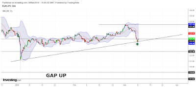
To conclude, for a valid short strategy, we need more information provided by the technical indicators. Otherwise,  the last red candle could represent only a volatility exhaust and a rebound of the cross. For this purpose, look at the BB and at the green arrow. The cross is testing the supports in the short-term, even if the trend is bearish in the long-term.

Chart from Investing.com

Thursday, February 21, 2019

GBP/USD : chart framework.

At a glance, we can notice some price levels. The last trend is bullish (confirmed also by the green candle), from 1.24 (see the bullish trendline). 
There is a support at about 1.249 and another at about 1.27. This last one is important due to the fact that previously, it represented a resistance (in the year 2017). 
Another price level is 1.32 : it is a resistance touched by the currency cross on October 2018 and in the year 2019 ; this resistance was touched also in the year 2017. 
See the following chart, to better understand the framework. 

Chart from Investing.com

The FIBO retracements are very useful in order to fix target prices. The price level at 1.32 is far important. It represents the 50% FIBO level and the watershed between a bullish continuation (with the break of the upward resistance) and a bearish signal (reversal with the repulsion of the mentioned resistance). 
Of course, to get a valid signal, we need more considerations. However, the price levels are pretty clear to set up a trading strategy. 

Chart from Investing.com

With a closer look, the situation is the same. The long candle is bullish and other indicators seem to confirm the uptrend : the crossover of the stochastics ; the intersections of the EMA bundle (10, 20, 50)  and the crossover of MACD and MOMENTUM (see the previous chart). 

Chart from Investing.com

With the last trading sessions, the bullish signal of the green candle would seem muffled (due to the shadows of the red candles, circled area). Anyway, let's look at the updates. 

Chart from Investing.com